 EpoxyGrind
Learning center
Why Your Call-to-Action Needs to Follow the Visitor Down the Page
A homeowner who scrolls to read your services or reviews and finds no way to act on what they just read has no reason to scroll back up.
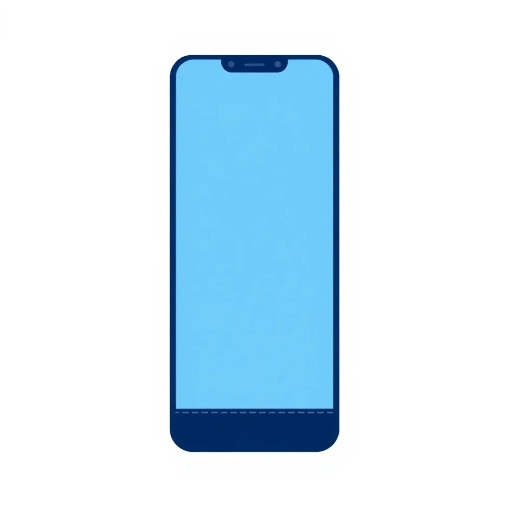
Your audit checks whether a call-to-action — a quote button, a phone number, a form link — stays reachable partway down the page, not just in the first screen. A page that puts its only CTA at the very top and nothing after loses everyone who scrolls to read more before they're ready to act, which for a $3,000+ decision is most homeowners.
Reading and deciding don't happen on the same screen
A homeowner comparing epoxy contractors typically scrolls through services, photos, and reviews before they're ready to act — that's the whole point of the content further down your page. If the only way to act on that decision is scrolling all the way back to the top, you've built a real, avoidable drop-off point right at the moment they were most convinced.
A sticky bar is the simplest version of this fix
The most common solution is a slim sticky header or footer bar with a phone number and a single button, present on every screen as the visitor scrolls. It doesn't need to be large or intrusive — the research above shows even a simple version measurably outperforms no persistent CTA at all, and the mobile-specific lift is larger than the desktop one.
This pairs directly with your above-the-fold CTA
Having a strong above-the-fold CTA is necessary but not sufficient — it only serves the visitors who act immediately. A persistent CTA catches everyone else: the ones who scroll to check your photos and reviews first, which per the local presence research is most of them.
Want us to just fix this for you?
Free audit shows you exactly what's costing you jobs on your own site — no obligation.
Related
FAQ
What's the simplest way to make a CTA reachable while scrolling?
A slim sticky header or footer bar with your phone number and a single quote-request button, present on every screen regardless of scroll position.
Does a persistent CTA hurt the page's design?
Not if kept simple — a thin bar with one clear action typically doesn't compete visually with the rest of the page, and the conversion data suggests the tradeoff is worth it.
Is this only relevant for very long pages?
It matters most on longer pages, but any page a visitor might scroll past the first screen on benefits from not losing the CTA entirely.